More on Icons
1 Nov 2023
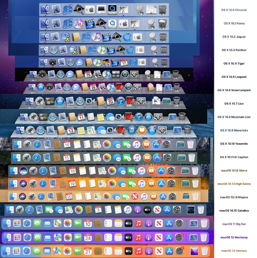
This is a sort of follow on to a post I wrote about how icons becoming homogenous and hard to distinguish, and inspired by this image posted to social media by Michael Flarup showing the evolution of the macOS default dock over many versions:

Whilst I’d be the first to admit to not being a fan of the heavily skeuomorphic apps like the old Notes.app with its faux leather titlebar and the old game center app, I also think that the older icons for notes and such were much more distinctive when you could recognise items by external shape as well as the content.
This reminder of what we’ve lost in terms of both usability and character in our icons inspired me to go back to this vibe with my placeholder icon for a little desktop app I’ve been writing for myself. The app has the working title of “BAM”, and so a literal explosion of shape and colour seemed appropriate, and something that would make it easily recognisable whilst hunting for it through all the rounded rectangles that otherwise seem to be all we’re allowed:

Ignoring the amateur quality of my ability to draw for the moment, the BAM icon being something I’d commission someone to replace should I ever release this app (at the moment I’m quite happy with this app having an audience of one), I feel having lived with my attempt to make an icon that harks back to the older days works really will in terms of usability for me: it’s never a struggle to pick it out on either the dock or the task switcher in macOS. Whilst it doesn’t really indicate what the app does, that makes it no worse than say half the other apps on my dock, including Finder itself, and that learning process is a one-off task versus the repeated attempt to pick it out on screen as I want to use it.
Even when I’m not looking for that app, the child-like playfulness of this icon makes me smile whenever I spot it; there’s a bit of character in a sea of icons all trying to be quite serious. It has (for me) a bit of the charm that I miss from computers of the past.
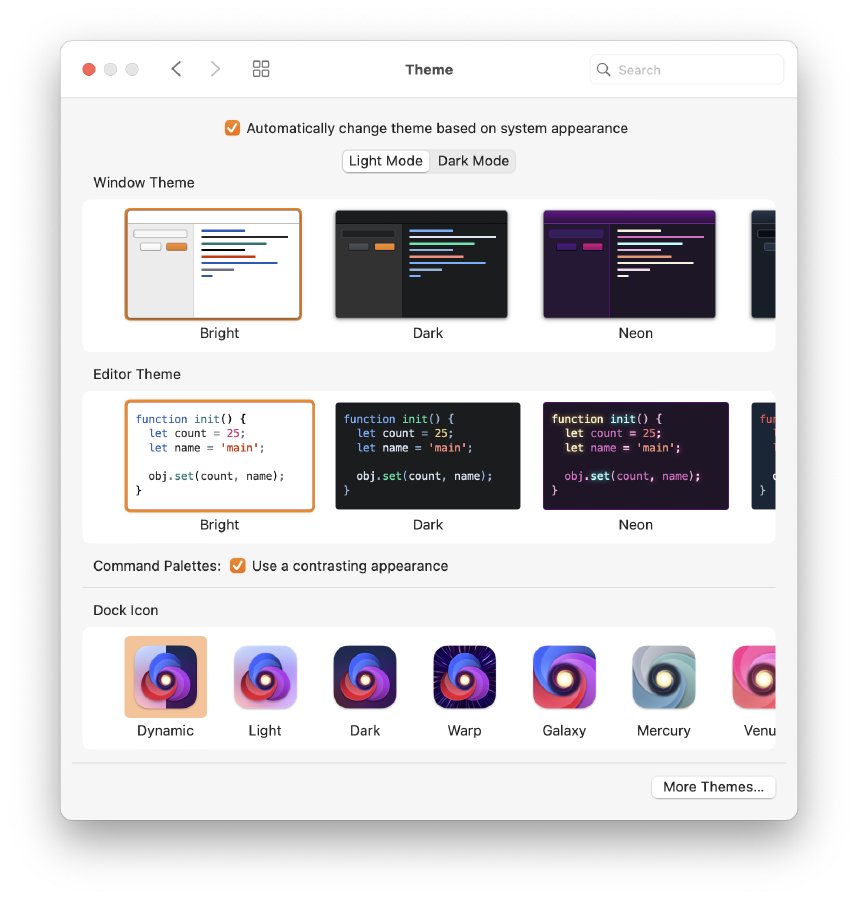
I’m sure this style doesn’t work for everyone, even if it was made nicer by someone with drawing skills: I remember comparing notes with my friend Jason about how we recognised icons, each of us finding icons with letters, colours and shapes differently distinctive, but for now that’s the joy of having an app with an audience of one. It’d be interesting to see if there’s research into how people respond to different icon shapes to work out if even having a single consistent icon is best, or really apps should come with multiple options that respond to some system-wide preference about what works best for that user. Currently many apps do come with themeable icons, such as Nova, which is the only non-round-rect on my iconbar, and that’s not its default icon, it has dozens for me to pick from, though all but one are round-rects:

So there’s no technology barrier here, just we need to convince product managers that there’s a distinction required for making things fit in with an aesthetic and being usable, which requires a different sort of fitting in.